Packaging and range architecture for a professional hairdressing foil brand — one visual language holding 50+ SKUs across widths, formats and finishes, extended into catalogue and ecommerce.
Packaging and range architecture for a professional foil brand — one visual language across 50+ SKUs, formats and finishes.
SKUs Designed
0+
Campaigns Art Directed
0+
Channels Managed
0+
Case Notes
The thinking behind the work.
The problem
One brand, many box sizes
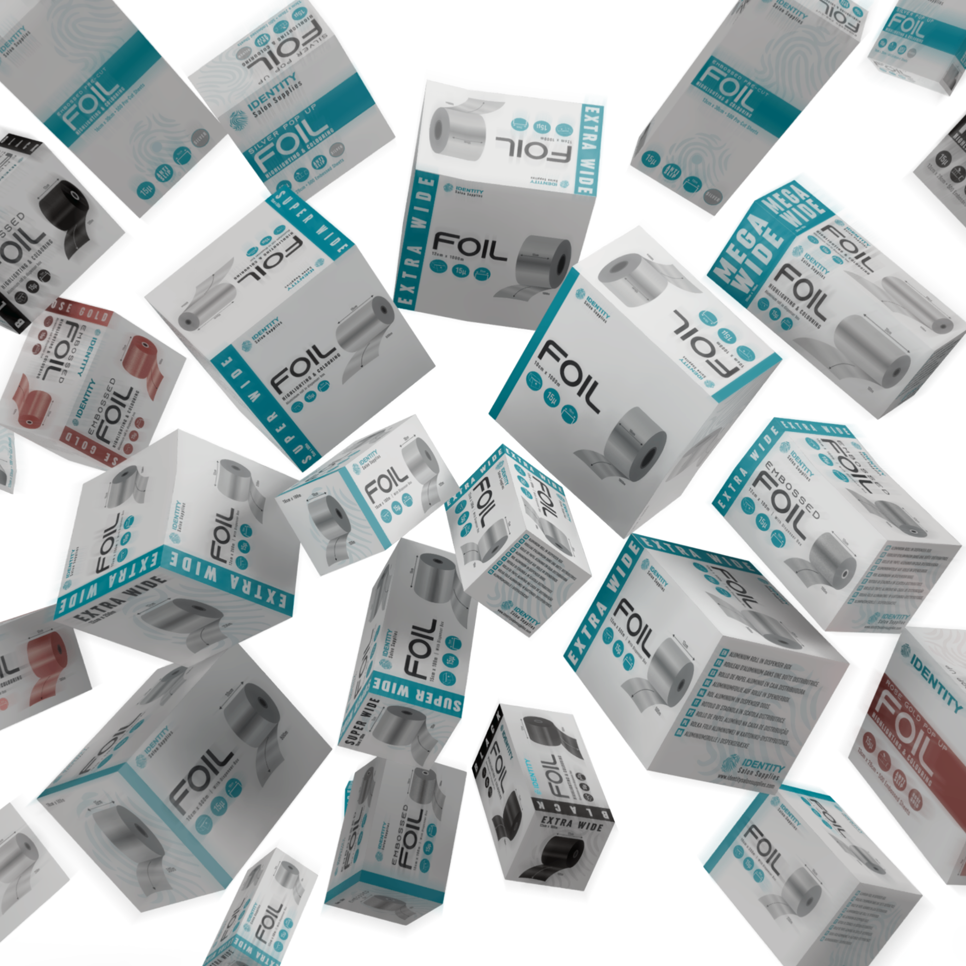
Identity's range spans standard, extra-wide, super-wide and mega-wide rolls plus pop-up, pre-cut, embossed, rose gold and black foils. Each has different physical dimensions, different selling points and different buyers — salons, colourists and distributors — yet all had to read instantly as the same brand on a shelf and in a marketplace thumbnail.
Design Decisions
- D-01
Fixed hierarchy
Type, dimensions, finish and features occupy the same positions on every pack, whatever the box size.
- D-02
Proportional layout
Artwork is built to scale ratios, so wide-format packs reflow without redrawing the design.
- D-03
Catalogue as navigation
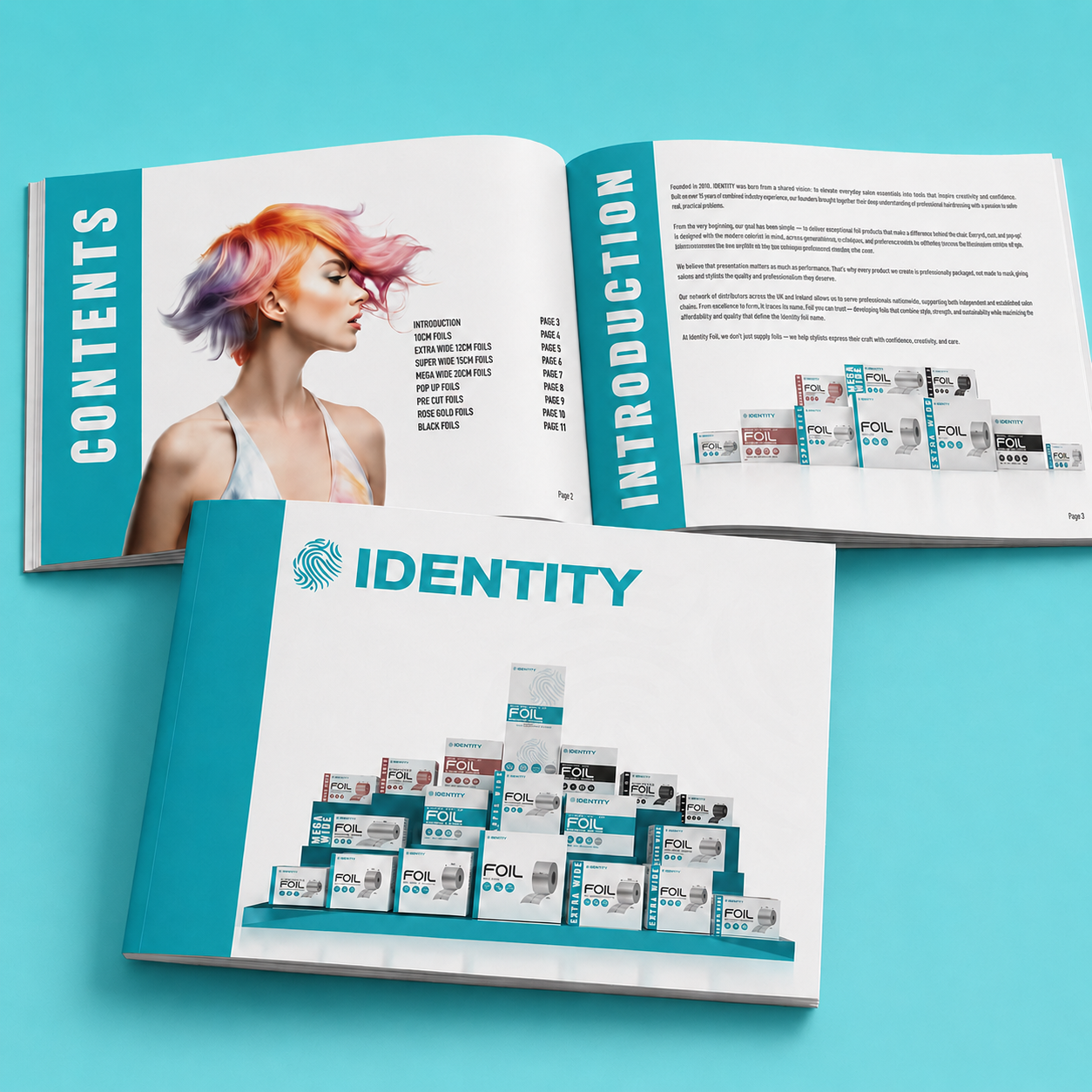
The catalogue mirrors the packaging architecture, making a 50+ SKU range easy for buyers to specify.
- D-04
Finish as differentiator
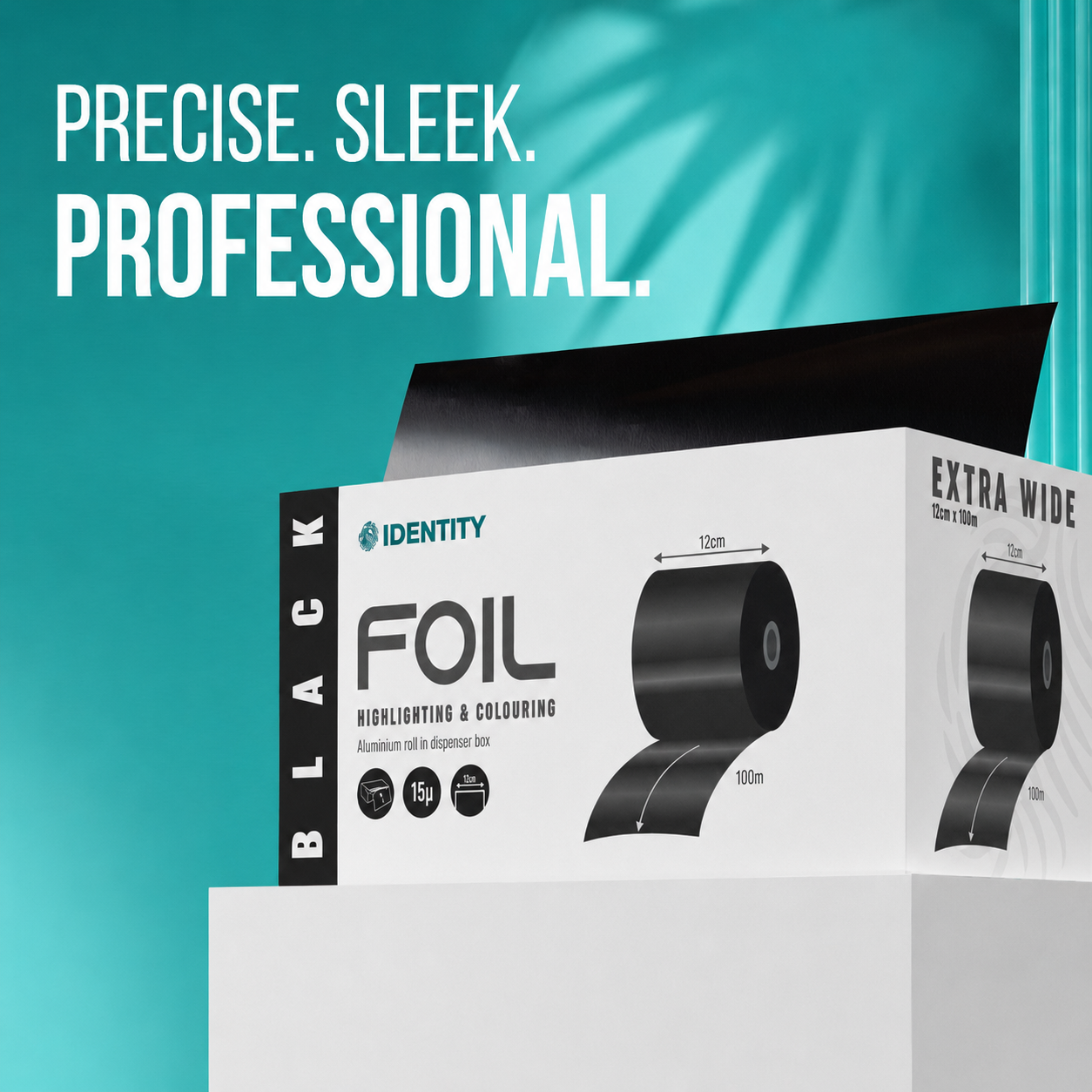
Premium lines are separated by material and finish rather than new layouts, so the range stays one family.
Role
- Brand & Packaging Designer & Project Manager
Skills Used
- Brand Identity
- Packaging
- Digital Design
- Adverts
- Catalogue
Tools Used
Full brief — detail
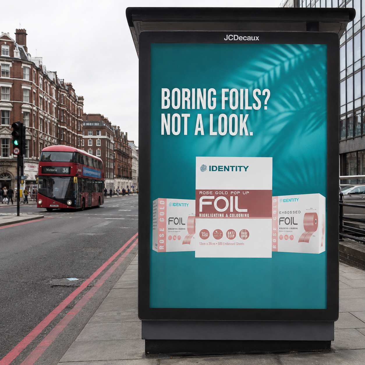
Identity is a professional hairdressing foil brand supplying a wide range of salon foils across multiple formats, sizes and finishes. My role covers the brand's visual output across packaging, advertising, print media, product mockups and catalogue design, alongside project management for Amazon marketplace graphics. The work focuses on presenting Identity as a professional, reliable and visually distinctive choice for salons, colourists and distributors.
Next project